- CSS notes
- Types of CSS
- Types of basic selectors
- Background image & its properties
- Box model
- Margin collapse
- Display properties
- Text-decoration property
- Types of family in fonts(types)
- Size, position and lists.
- The position property
- Z-index property
- Flexbox
- Setting an element for a flexbox
- Setting an element for a grid container
- CSS media queries
- Transforms, Transitions and animations.
- CSS 3D transformations methods.
- CSS transitions
- CSS Animations
- Inline CSS - Using CSS in a tag, like this -
<body>
    <p style="text-align: center;">
        This is a paragraph.
    </p>
</body>- Internal CSS - Using CSS in
<head>tag of HTML,in this we use css for a tag and then using this tag in body will inherit all the properties, like this-
<head>
    <style>
        p {text-align: center;
        background-color: rgb(239, 239, 225);}
    </style>
</head>- External CSS - In this we create a sepereate
.cssfile and use css seperately in that file, by creating classes and using css for specific id's etc, example-
<head>
    <link href="style.css" rel="stylesheet">
</head>- CSS element selector
- CSS id Selector
- CSS class Selector
- The CSS grouping Selector
Example -
/* class selector  */
.cenAlign{
    text-align: center;
    border: 2px solid yellow;
}
.bgBlue{
    color: red;
    background-color: rgb(60, 14, 226);
}

/* element selector  */
h2 {
    text-align: center;
}

/* id selector  */
#mySpan1{
    color: yellow;
    text-align: center;
}

/* grouping selector */
span, footer{
    color: rgb(241, 0, 241);
}- With * selector we can set properties for every element in html.
- We can set BG by
background-imageproperty while styling body tag of html like this-
body {
    background-image: url('./assets/back1.jpeg');
    background-repeat: round;
}- Their is also a background-repeat property for repeating type of image in background.
- Types of background-repeat options
background-repeat: repeat-x;- This repeats image in x axis.background-repeat: repeat-y;- This repeats image in y axis.background-repeat: no-repeat;background-repeat: space;- This will repeat image in x axis but it will take care that every image is shown completely, if not it will remove last image and adjust space of that between other images.Background-sizepropertybackground-size: auto;- automatically image is set as per the size of it.background-size: cover;- Just fills the image all over the element on which you've set the image.background-size: contain;- Fits the image, as it is fully visible.background-size: 100px 100px;- Giving size manually. (It will effect looks of image)background-positionproperty
  /* Keyword values */
background-position: top;
background-position: bottom;
background-position: left;
background-position: right;
background-position: center;

/* <percentage> values */
background-position: 25% 75%;

/* <length> values */
background-position: 0 0;
background-position: 1cm 2cm;
background-position: 10ch 8em;

/* Multiple images */
background-position: 0 0, center;

/* Edge offsets values */
background-position: bottom 10px right 20px;
background-position: right 3em bottom 10px;
background-position: bottom 10px right;
background-position: top right 10px;

/* Global values */
background-position: inherit;
background-position: initial;
background-position: revert;
background-position: revert-layer;
background-position: unset;background-attachmentproperty
/* Keyword values */
background-attachment: scroll;
background-attachment: fixed;
background-attachment: local;

/* Global values */
background-attachment: inherit;
background-attachment: initial;
background-attachment: revert;
background-attachment: revert-layer;
background-attachment: unset;-
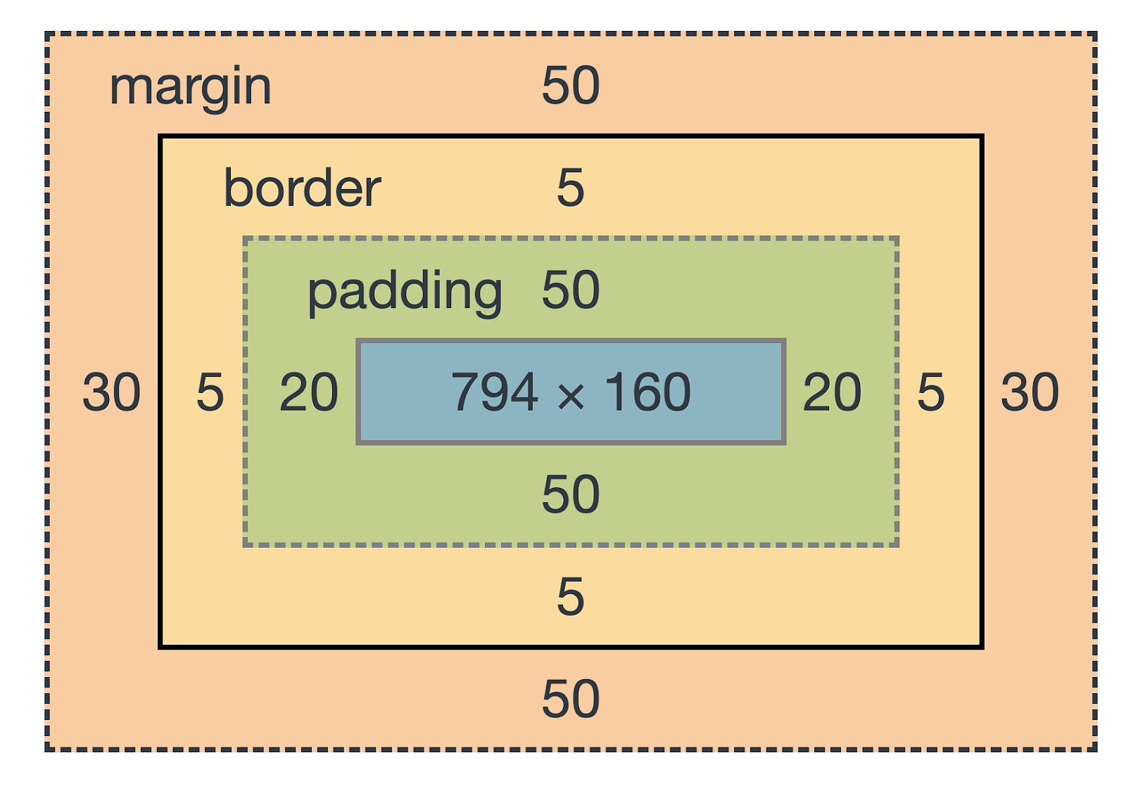
The box model describes how
content, padding, border, marginthese elements work together to create a box as displayed by CSS. -
like shown in this image
-
Represented box model in this FILE
-
Padding
/* top | right | bottom | left */
padding: 5px 2px 0 4px;

/* top&bottom | left&right */
padding: 5px 2px;

/* all sides */
padding: 4px;- Margin
- Above style to set padding same works in margin.
/* If we put margin to auto then it will automatically give eqal margin to both of the sides
*/
margin: auto;- Border
border-width: 3px;
border-style: solid;
/* More values of border-style */
/*
dashed
dotted
double
groove
hidden
inherit
initial
inset
none
outset
ridge
*/

/* Also we can specify border like this */
/* top | right | bottom | left */
border-style: none solid dotted dashed;
border-color: red;

/* It rounds the corners of the border.
if you keep increasing the radius it will become
a circle */
border-radius: 20px;-
If their are two elements and their margin is collapsing then the browser set the margin between these two elements who's margin is greater, or if margin is same then only once the margin is given.
-
like if element A has 3px margin and element B also has the same margin then - the distance between these two element will be of 3px.
-
and if margin is greater in any element then it will be the distance between those two elements.
-
box Sizing -
Determines what out of padding and border is included in elements width and height can be content-box or border-box Include only content in width/height
.div1{
          box-sizing: border-box;
}- The content width and height includes, content + padding + border
- Inline, block
- Inline elements are those tags which doesn't require whole line to exist, example -
<em>,<strong>,<img> - Block elements are those tags which require whole line to exist, example -
<div>,<li>.
/* precomposed values */
display: block;
display: inline;

/* In inline-block we can use padding/margin whereas in inline we can't*/
display: inline-block;
display: none vs visibility: hidden
- With display: none, the element is removed from the document flow. Its space is not blocked.
- With visibility: hidden, the element is hidden but its space is reserved.
- Used to decorate the text, It can be overline, line-through, underline, none.
text-decoration: underline;
text-decoration: underline dotted;
text-decoration: underline dotted red;
text-decoration: green wavy underline;
text-transformation
/* Keyword values */
text-transform: none;
text-transform: capitalize;
text-transform: uppercase;
text-transform: lowercase;- font family - A specific font style
- Generic familly - Collection of many font styles.
-
Size Relative lengths These units are relative to the other length property. Following are some of the most commonly used relative lengths,
-
em– unit relative to the parent font size, em means “my parent element’s font-size” -
rem– unit relative to the root font size ( tag) -
vw– unit relative to 1% viewport width -
vh– unit relative to 1% viewport height -
%- unit relative to the parent element -
Min/max- height/width property
CSS has a min-height, max-height, and min-width, max-width property.
min-height: 10%;
max-height: 20%;
min-width: 10%;
max-width: 20%;-
Used to manipulate the location of an element
-
Following are the possible values:
-
static: The default position. top/bottom/left/right/z-index has no effect -
relative: The top/bottom/left/right/z-index will now work. Otherwise, the element is in the flow of the document like static. -
absolute: The element is removed from the flow and is relatively positioned to its first non-static ancestor. top/bottom etc. works -
fixed: Just like absolute except the element is positioned relative to the browser window -
sticky: The element is positioned based on the user’s scroll position
- It is kinda like layers in a burger, the uppermost layer will be visible to us, and if we wanna se the below layer we'll have to remove top most layer.
- Float property
/* We can float a element through this property, in right or left direction. */
float: right;
float: left;- Clear property - It is used to clear up left and right space of a element in which float property has been set.
- This property only works when, the element on which we're applying this property has 1 or more elements floating before it.
<style>
    .content1 {
        background-color: blue;
        width: 40vw;
        height: 40vh;
        float: right;
    }

    .content2 {
        background-color: rgb(0, 255, 0);
        width: 40vw;
        height: 40vh;
        float: right;
        clear: both;
    }
</style>
<body>
    <div class="content1">box1</div>
    <div class="content2">box2</div>
</body>- In above example box2 will clear space in both right and left side of it, and first box will shift below the second box.
.container {
    display: flex;                  /*Initialize a flexbox*/
}-
flex-direction property- Defines the direction towards which items are laid. It can be row (default), row-reverse, column and column-reverse -
Flex properties for parent (flex container)
Following are the properties for the flex parent:
flex-wrap: Can be wrap, nowrap, wrap-reverse. This wraps the elements inside flexbox when screen resolution decreases.justify-content: Defines alignment along the main axis.
Possible values -center,right,left.align-items: Defines alignment along the cross axis,
Possible values -center,baseline- for top,end.align-content: Aligns a flex container’s lines when there is extra space in the cross axis. Basically when their is extra space between flex elements while aligning cross axis then we use this property.
Following are the properties for the flex children:
order: Controls the order in which the elements appear in the flex container.align-self: Allows default alignment to be overridden for the individual flex itemsflex-grow: Defines the ability for a flex item to growflex-shrink: Specifies how much a flex item will shrink relative to the rest of the flex items
First make container a grid container by this.
.container {
    display: flex;
}- Then we can use further these properties to customise our grid container and its items.
.container {
    grid-row-gap: 2px;
    grid-column-gap: 5px;

    grid-gap: 2px; /* this will set column and row gap together and of same length. */

    grid-template-columns: 20px 20px 9px;
    grid-template-rows: 20px 20px 9px;
    /* the above one defines number of columns/rows and their width/height. */

}-
align-content-
valid arguments -baseline,center,end,space-between,space-around. -
justify-content- same as in flexbox.
grid-column: We set this property in that element in which we want to exceed from1 / nwherenrepresents n'th column till where we want to expand this perticular element/item.grid-row- It also does the same thing asgird-columnbut it works on row.
Example - below/ or look in this File
#firstel {
        grid-column: 1/3;
        grid-row: 1/3;

        /* Another style u can use it write it like this. */
        grid-column: 1/ span 3;
}- This is basically used to make our website responsive.
- It is nothing but like checker of a event or say condition like viewport width if between 1 and 500px so it will run this code of css and if we specify some another case then css provided under that case will be triggered.
Example -
@media only screen and (max-width: 500px){
    body {
        background-color: red;
    }
}Transforms are used to rotate, move, skew or scale elements. They make a 3D effect.
transform- Used to apply 2D or 3D transformation to an element.transform-origin- The place by which / around which the element rotates. Possible values -left, right, center, Example -
2D transformations - we can change x & y exis. 3D transformations - we can change even z exis also.
Even we can use more than one transformations on an element at a time.
- translate() - move element in X or Y exis, argument -
translate(X, Y) - rotate() - possible values in turn eg -
0.5turn, in degrees eg -45deg - scaleX() - Scaling in X direction.
- scaleY() - Scaling in Y direction.
- scale() - Scaling in both X & Y direction simultaniously, eg -
scale(2, 3) - skew() -
- matrix() - We can set above properties in with this in once. eg -
matrix(scaleX(), skewY(), skewX(), translateX(), translateY()).
You can use degree values in below properties.
rotateX()- it is basically rotating the element around X axis.rotateY()- it is basically rotating the element around Y axis.rotateZ()- it is basically rotating the element around Z axis.
It is used to change properties of elements in html very smoothly, over a given time duration.
-
The transition property
-
transition-property- The property of element you want transtion in, for eg - width -
transition-duration- Duration in which you want to see the transition. -
transition-timing-function- How you want the property to do transition. -
transition-delay- After how much delay the transition should take place.
Here is a short hand property for setting above all things at once
transition- property duration timing-function delay;
#img1 {
    transition: width 1s ease-in 0s;
}- Transitioning multiple properties
#img1 {
    transition: width 1s ease-in 0s, height 1s ease-in;
    /* We can also skip any one argument as we did in the second transition of height, we skipped delay. */
}Through this we can transit multiple CSS properties of an element, we could use transitions also but for more number of changes/transitions the code will get longer, so here animations gives us shorter way to do that.
Properties to add animations
-
animation-name- name of the animation -
animation-duration- how long does the animation run? -
animation-time-function- same as transition. -
animation-delay- same as transition. -
animation-iteration-count- number of times the animation should run. -
animation-direction- specifies the direction of the animation. example arguments are -normal,reverse- animations starts from ending.,alternate-reverse- it will go and then come back and then repeat (to and from movement) -
Using above properties sample is given in this FILE Animation setting shorthand property
#box1 {
    animation: anant 65 linear 15 infinite reverse;
}- One more example below
#box1 {
    #box1 {
    height: 70%;
    width: 50%;
    background-color: red;
    animation: change1 1s 0.5s ease-in alternate-reverse infinite;
}

}
@keyframes change1 {
    from {
        width: 50%;
        height: 70%;
    }
    to {
        width: 60%;
        height: 80%;
    }
}