- Video tutorials peer-review
- Workshop: HTML, CSS & GitHub recap
- Tutorials on Sharing is caring
- Add your video's links to the Google doc (link on Slack).
- Let's chat about how you made it and what you learned.
We're going to refresh our working knowledge of HTML, CSS and GitHub, and learn a few new CSS tricks that can come useful for your Sharing is caring brief.
Last week we've learned how to:
- Get images to fill up the whole browser's window, without loosing their original aspect ratio (
background-size: cover) - Position elements in the horizontal and vertical centre of the page (using the
position: absolute, top: 50%, left: 50% and negative margintrick) - Create curtain reveal effect with CSS only (
background-attachment: fixed)
Here's all the code for the finished thing.

This week we'll:
-
Demo how the signup form is centred
-
Check out the peer-learning video to explain
position: relativeandposition: absolute(also see demos below) -
Introduce
flexbox, a new powerful layout system for CSS, which makes possible (and almost easy) some of the things that so far were hacky and complicated-
FlexboxFroggy, a game to learn
flexbox
-
Use Git to publish your page on GitHub Pages, the free hosting service from GitHub.
-
If you already have a repository for your project, skip to the next step.
Otherwise... create a new repository.
Make sure you
Initialize this repository with a README.
-
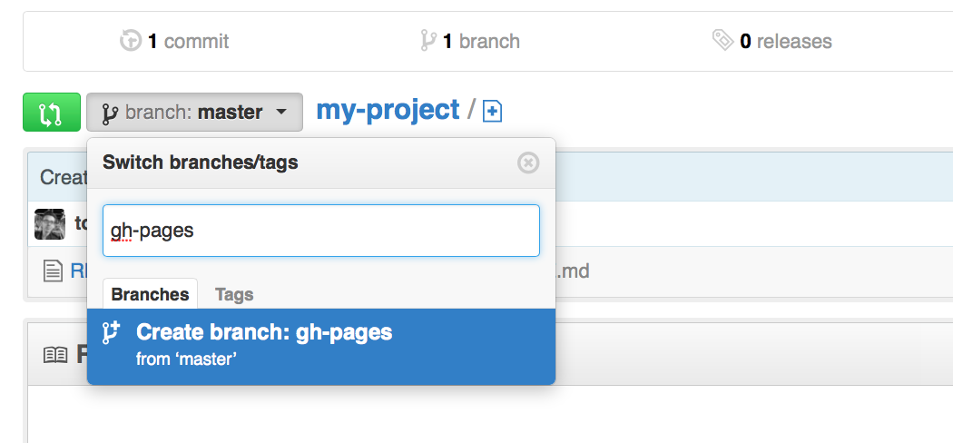
In your repository's main page, create a new branch and call it
gh-pages(call it exactly like that: no uppercase and no spaces). -
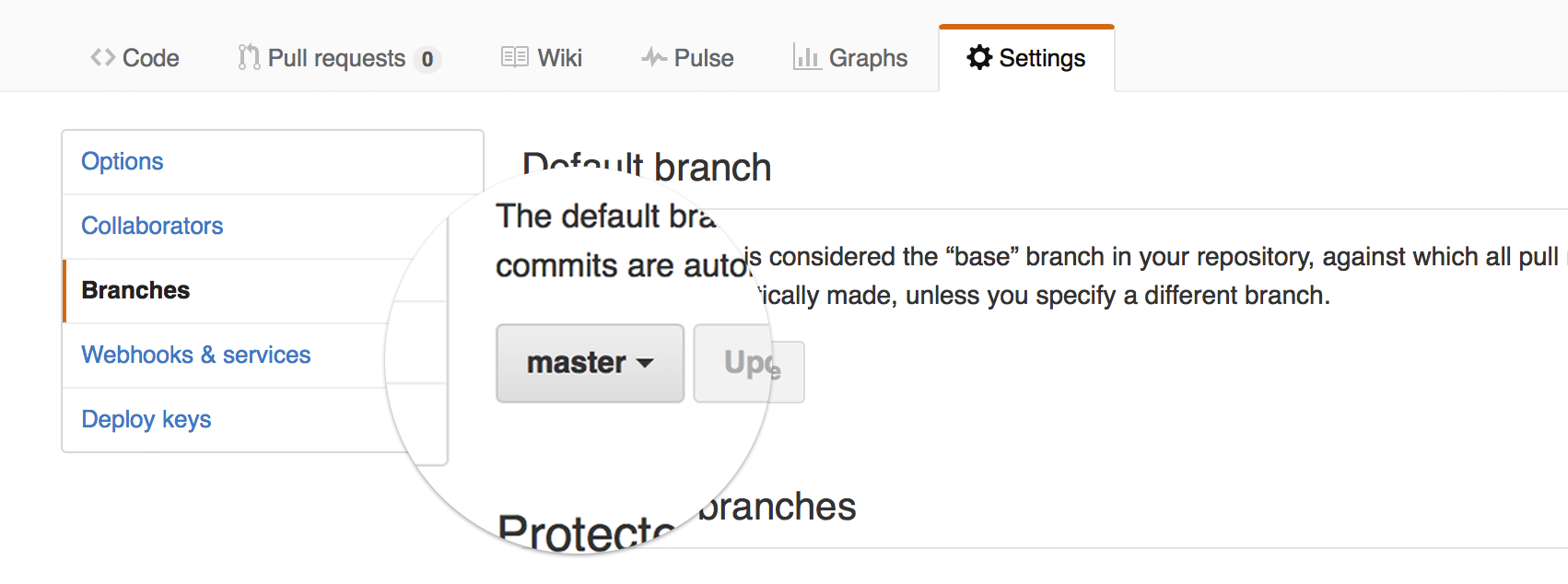
Make
gh-pagesthe default branch. -
Use SourceTree to clone your repository to your computer.
Cloning means downloading a working copy of the repository on your computer. You'll then be able to make work on the repository on your computer and push your work to GitHub.
On a Mac: cmd + n
On a PC: ctrl + n
Clone from URLand paste in your repository's URL (eg:https://github.com/YOUR-GITHUB-USERNAME/YOUR-REPOSITORY-NAME) -
Make sure that your working copy (the version of your repository on your computer) is on the
gh-pagesbranch. In the image below, notice that the local branch ismaster(in bold underBRANCHES). If that's the case for your repository, then right-click ongh-pagesunderREMOTESand then chooseCheckout.... This will switch your working copy to thegh-pagesbranch.
-
If you haven't already, move all the files for your page (HTML, CSS, images... everything that makes up your page) into the repository's folder.
-
Using SourceTree, commit and push all those files.
Notice that as soon as you commit, a red
1appears on top of thePushbutton. In order to upload those files to GitHub you need to push all your commits (push that button). -
After you pushed to the
gh-pagesbranch your page will be automatically updated by GitHub.To view your page, go to
https://YOUR-GITHUB-USERNAME.github.io/YOUR-REPOSITORY-NAME(notice it's github.io instead of .com).That's it, now your page is published, you can celebrate (and share the link on Slack)! 🎉

Laying out content using CSS is easy. You chop your page up and shove the chunks wherever you please...
To become a skilled CSS bricklayer, there are only two properties that you should really learn
position(see the docs on WebPlatform)float(see the docs on WebPlatform)
-
staticis the default value.Static elements just sit in the normal HTML flow.
-
relativeis similar tostaticbut the element can be offset from its original position with the propertiestop,right,bottomandleft. -
absolutepulls an element out of the normal HTML flow and other elements will behave as if it's not even there.The offset values for
top,right,bottomandleftof an absolutely-positioned element will be relative to its first non-static ancestor. 😱For example,
left: 10pxwill offset an absolute element 10 px from the left edge of its first ancestor which is not static (it can be the direct parent, or the parent of the parent, or the parent of the parent of the parent... as long as it is the first which is not static).Note that without a
widthset, the element will stretch only as wide as the content it contains.You can set, for instance, both a
leftandrightvalue and the element will stretch to touch both points. So you can fill a screen by settingtop: 0; left: 0; bottom: 0; right: 0;
-
fixedbehaves likeabsolute, but it will position an element in relation to the browser window.Fixed elements stay where they are on the screen even when the page is scrolled.


The animated gifs above are from [this article on Froont](images from http://blog.froont.com/positioning-in-web-design).
Play around with position using this interactive example on CodePen
The most powerful use of position is absolute inside relative. Double OMG 😱😱
Floating an element will allow surrounding content to flow around it.
Using float you can
float: leftfloat: rightfloat: none(default)
Then, if you do not want the next element to wrap around the floating objects, you can apply the clear property
clear: leftwill clear left floated elementsclear: rightwill clear right floated elementsclear: bothwill clear both left and right floated elements
Floating is commonly used to create layouts with columns.
Play around with float using this interactive example on CodePen
Learn more about float on CSS Tricks.
This project is about using code (HTML, CSS and a dash of JavaScript) creatively to communicate and advocate a cause you care about.
All the project material is here.
Let's review your ideas and sketches in small groups.
We can think of the WWW as a Web of interlinked knowledge in constant evolution.
To put this concept into practice, let's pretend that each one of us is a node in a network of knowledge. Each node will hold information about a certain concept related to the WWW.
In teams, research one key Web concept to explain to your classmates next week.
Keep in mind: next week we'll do this without screen-based slides, so don't prepare a presentation but rather be ready to discuss your topic with everyone else!
| Who | What |
|---|---|
| Tom Will |
Tim Berners-Lee |
| Joe Kaleshe |
HyperText |
| Akvile Ben Josh |
HTTP |
| Melissa Dean |
DNS |
| Rosie Shajee |
IP address |
| Francisco Afsara |
Browser |
| Mark Malore |
Server |
| Darren Rajeev |
Internet submarine cables |
| Jennifer Ajay |
Net neutrality |
Put your team's research notes in a Google document (next week you'll have to blog about it).
In your research notes, make sure you reference your sources of information. That is, don't just copy-paste from Wikipedia. Instead, include a link to the Wikipedia article where your text comes from.
Complete the tutorial JavaScript for cats, and blog about it! 🙀