This website was created as a learning project to explore modern web technologies and advanced front-end techniques. The main purpose of this project was not only to develop a functional website but also to understand, optimize, and deploy a production-ready landing page with advanced animations and interactions.
Key points:
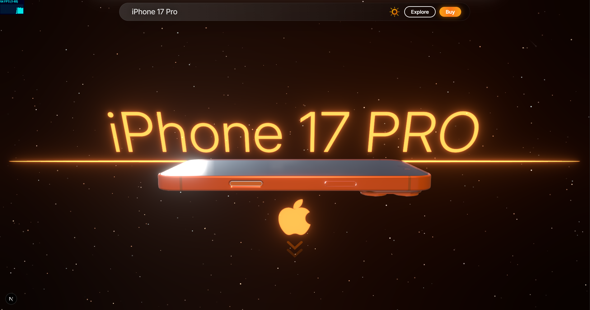
- The design is original and developed during the learning process. It is inspired by the official iPhone 17 Pro landing page by Apple, which was built by hundreds of developers.
- The website incorporates 3D models, scroll animations, gradient animations, dark/light themes, splashscreens, and responsive layouts to mimic a professional production-grade site.
- This project focuses on learning the latest Next.js features, React-based animations, Tailwind CSS, and deployment optimizations.
project-root/
├─ public/
│  ├─ vid/                     # All videos used for hero and sections
│  ├─ images/                  # Images used for mobile fallback and backgrounds
│  └─ 3d-models/               # GLB/GLTF models (iPhone 17 Pro)
├─ src/
│  ├─ components/              # React components
│  │  ├─ SplashScreen.tsx      # Initial loading splashscreen
│  │  ├─ VideoQualitySection.tsx
│  │  ├─ HeroSection.tsx       # 3D hero component
│  │  ├─ AnimatedNavbar.tsx
│  │  ├─ HighlightsSlider.tsx
│  │  └─ Footer.tsx
│  ├─ styles/                  # CSS & Tailwind utilities
│  │  └─ globals.css
│  ├─ pages/
│  │  ├─ index.tsx
│  │  └─ _app.tsx
│  └─ utils/                   # Helper functions for animation, scrolling, etc.
├─ package.json
├─ tailwind.config.js
└─ next.config.js
Next.js is used as the primary framework for the project, offering a modern React-based approach with server-side rendering (SSR) and static site generation (SSG).
Key Implementation Points:
- Utilized Next.js routing for structured navigation and SEO-friendly URLs.
- Leveraged SSR for critical sections to improve first contentful paint (FCP) and optimize SEO.
- Employed SSG for static pages like About, Features, and Documentation to reduce server load.
- Implemented dynamic imports and code-splitting to load components only when needed.
- Enabled production-ready optimizations including minification, image optimization, and caching.
React Three Fiber allows seamless integration of WebGL-powered 3D content within React components.
Key Implementation Points:
- Loaded GLB/GLTF iPhone models with lighting, rotation, and scaling controls.
- Integrated HDRI environments for realistic lighting and reflections.
- Optimized models for desktop usage while providing static image fallbacks for mobile.
- Managed animation loops and frame updates using
useFramefor smooth motion. - Configured shadows and camera perspectives to enhance realism.
Scroll-based animations enhance the interactive and cinematic feel of the website.
Key Implementation Points:
- Controlled scroll progress using
useEffectandgetBoundingClientRect(). - Created smooth fade-in/out, scaling, and video transitions tied to scroll position.
- Applied motion to sections like `VideoQualitySection``.
- Fine-tuned easing functions to achieve natural, responsive animations.
- Used Framer Motion for handling complex animations with declarative syntax.
Tailwind CSS and custom CSS were used to create visually appealing gradients and animations.
Implemented Effects:
- Moving gradients:
.bg-gradient-animate,.animate-gradient-x. - Shine effects on elements:
.animate-shine. - Animated borders for cards:
.card-border-animated. - Theme-aware CSS variables ensuring animations adapt to dark/light modes.
- Smooth transitions for hover, focus, and interactive states.
The project supports a fully theme-aware design system.
Implementation Details:
- Utilized CSS variables to control background, text, accent, and surface colors.
- Enabled smooth transitions between dark and light modes using
data-themeattributes. - All components dynamically inherit color schemes for a professional, cohesive appearance.
- Ensured animations, gradients, and interactive elements respect the current theme.
A splashscreen ensures a smooth loading experience before assets are fully prepared.
Key Features:
- Displayed until the 3D hero model and all WebGL assets are fully loaded.
- Prevents layout shifts and flashes of unstyled content.
- Tracks loading progress with a visual progress indicator.
- Smooth fade-out transition once the website is ready for interaction.
Optimized for both desktop and mobile users.
Implementation Details:
- Desktop: full 3D models, video sections, and interactive animations.
- Mobile: static images and simplified animations to improve performance and reduce CPU/GPU load.
- Tailwind CSS breakpoints used for responsive layouts and fluid design.
- Videos are preloaded on desktop but replaced with static images after playback to conserve resources.
- Implemented lazy loading for non-critical assets.
The navbar is interactive and adapts to scrolling and user interaction.
Features:
- Highlights active links based on scroll position.
- Smooth hover animations for menu items.
- Sticky positioning to maintain accessibility while scrolling.
- Theme-aware colors and subtle transitions for enhanced UX.
- Animated Pull down svg bar (open /close)
Deployment Workflow:
- Initially tested locally and on Hostinger shared hosting for basic functionality.
- Optimized assets, resolved bugs, and deployed on Vercel for production.
- Configured caching, CDN, and build optimizations for faster load times.
- Monitored performance metrics to ensure consistent experience across devices.
- Pre-made iPhone GLB models were designed for 3D software, not web.
- Each model is around 1 MB, causing long initial load times.
- Optimizations included compression and fallback images.
- Custom HDRIs were heavy and not fully optimized for web.
- Initial render times were higher due to realistic lighting calculations.
- Initial page load can take several seconds due to large assets.
- Subsequent loads optimized through caching, reducing load to ~2 seconds.
- Videos are skipped on mobile to reduce bandwidth and CPU usage.
- Desktop video playback replaced by static images after playback for optimization.
- Detailed comments for every component and utility.
- GitHub issues and milestones tracked feature implementation and debugging.
- Animations, 3D integration, and theme features documented for future reference.
- Emphasis on maintainable, modular, and reusable code.
- Next.js Documentation – for React SSR/SSG best practices.
- Tailwind CSS Documentation – for utility-first styling and responsive design.
- React Three Fiber Documentation – for 3D model integration.
- GSAP Documentation – for scroll-triggered animations.
- Sketchfab – source for free 3D models.
- Apple iPhone 17 Pro Official Page – design inspiration.
- AI & Learning Tools: ChatGPT, Gork, Gemini, Perplexity Learn for coding guidance and best practices.
- The website is intended for learning, skill showcase, and exploration of modern front-end technologies.
- All designs, interactions, and animations were implemented from scratch.
- Focused on creating a professional production-style website experience.